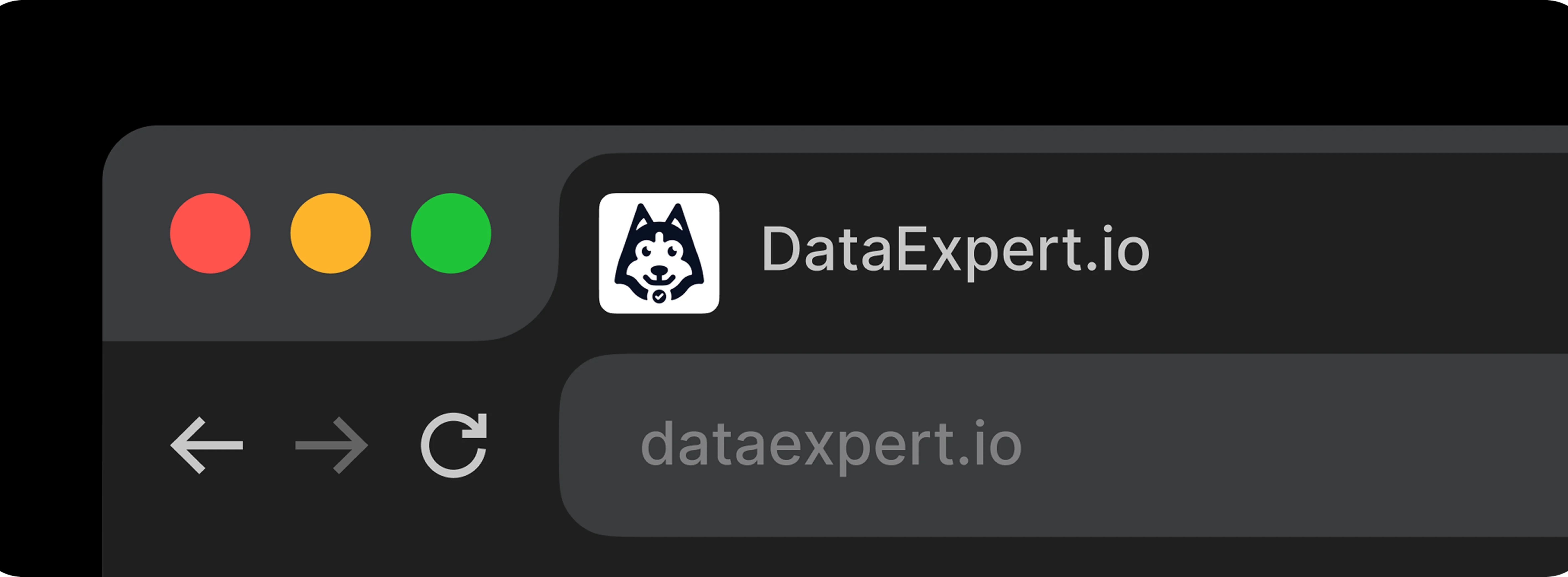
DataExpert.io
Branding
.webp)
About The Client
DataExpert.io is a fast-growing bootcamp and learning platform for mid-level data professionals looking to advance their careers. Founded by Zach Wilson, an influential voice in the tech space, the platform provides intensive six-week programs backed by mentorship and a vibrant learning community.
About The Project
DataExpert.io partnered with OnePlusOne Solutions to build a comprehensive visual identity that could match their mission and momentum. The goal: craft a brand system that’s modern, approachable, and infused with community energy—without sacrificing clarity or professionalism.

The Challenge
The brand needed to speak to data professionals—many already working in tech—without feeling sterile or overly corporate. DataExpert had a unique voice: warm, direct, and slightly unconventional thanks to the inclusion of Lulu the dog as part of the founder’s personal brand. The identity had to balance that friendliness with authority, and work seamlessly across social platforms, learning interfaces, and marketing assets.

The Solution
We leaned into the concept of mentorship and curiosity by building a visual system that’s intelligent, flexible, and personal. Lulu the dog became the face of the brand—a unique, emotionally resonant mascot that signals openness and approachability. The brand system we created emphasized legibility, contrast, and hierarchy, helping learners navigate complexity while feeling at ease.a flexible and scalable visual identity system, complete with the delivery of comprehensive brand guidelines.
Deliverables
At the center of the new identity was Lulu the Dog, a lighthearted yet meaningful brand icon. Lulu represented core values like curiosity, loyalty, and guidance—making her the perfect mascot for a mentorship-driven learning experience.
We developed a mascot system around her, using Lulu as a visual anchor in logos, icons, and social content, while also integrating dog-themed visual touches across branded illustrations and iconography.
Logo
We then created a modular logo system, including a primary lockup, standalone wordmark, and icon variants—all adaptable across different screen sizes and use cases. Alongside this, we defined a vibrant yet professional color palette with tones like Cyber Indigo, Nano Teal, and Byte Bone to reflect both technical focus and warmth. We paired these with a strong typographic foundation built on Plus Jakarta Sans, selected for its balance between friendliness and structure.
.webp)
Colors
The final output empowered the DataExpert team to scale their brand confidently and cohesively.
.webp)
Typography
To support consistency and implementation, we built a full brand guideline document detailing usage rules, spacing systems, and accessibility considerations. This included a set of iconography rules (with options for light and dark themes), visual direction for social media assets (from Instagram highlights to YouTube banners), and downloadable components to support internal and external design teams.

.webp)
Project Conclusions
The refreshed identity gave DataExpert.io a clear, recognizable voice in a saturated edtech and career development market. Lulu became a community favorite, helping humanize the brand and drive engagement across social platforms. Internally, the brand toolkit streamlined onboarding for new contributors and helped unify marketing, course materials, and social presence under one cohesive umbrella.
Let’s Work Together

.webp)
.webp)
.webp)
.webp)
.webp)


.webp)
.webp)
.webp)