nOS
UX/UI Design

About The Client
To launch this ambitious project, our client initiated a tender. And we aimed at winning this competition! A strategic research session with our internal team determined the motion vector – we needed to find an absolutely new style and become different from other contest participants.
About The Project
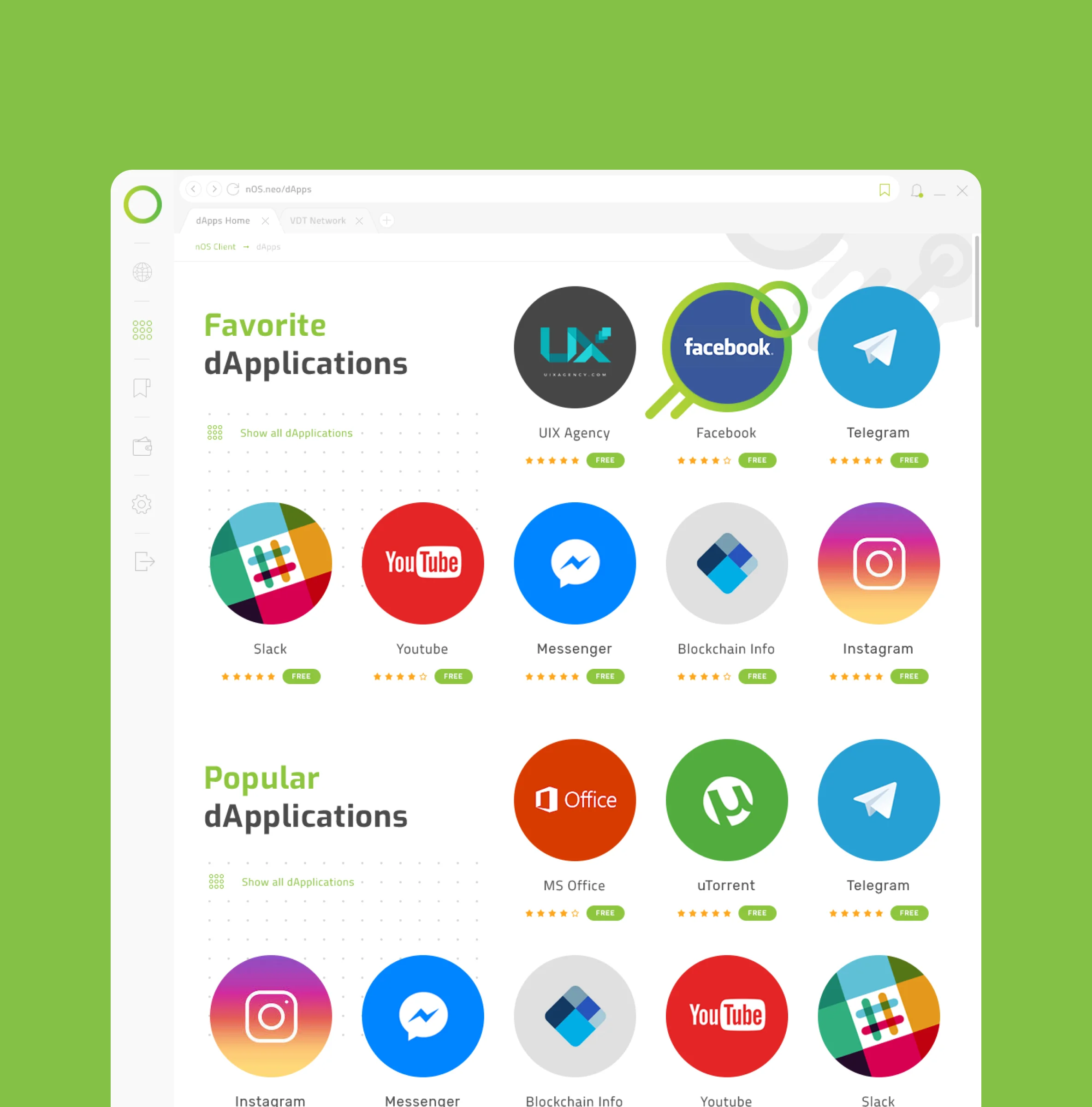
The task was not only to change colors and shapes of the various dashboard elements but to highlight the website navigation with the company logo-like geometrical shapes, minimalism, and numeric clarity.
Project Overview
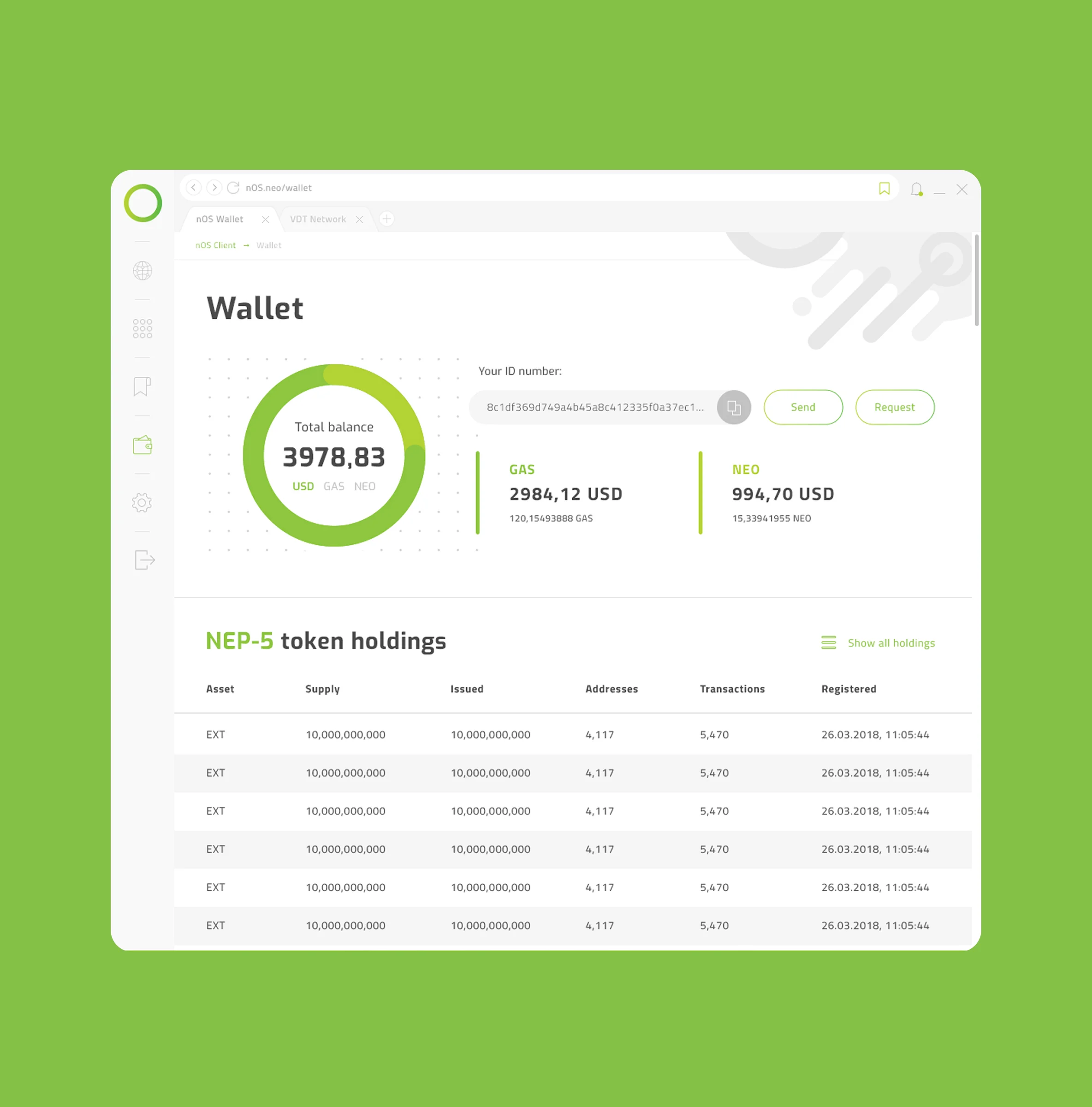
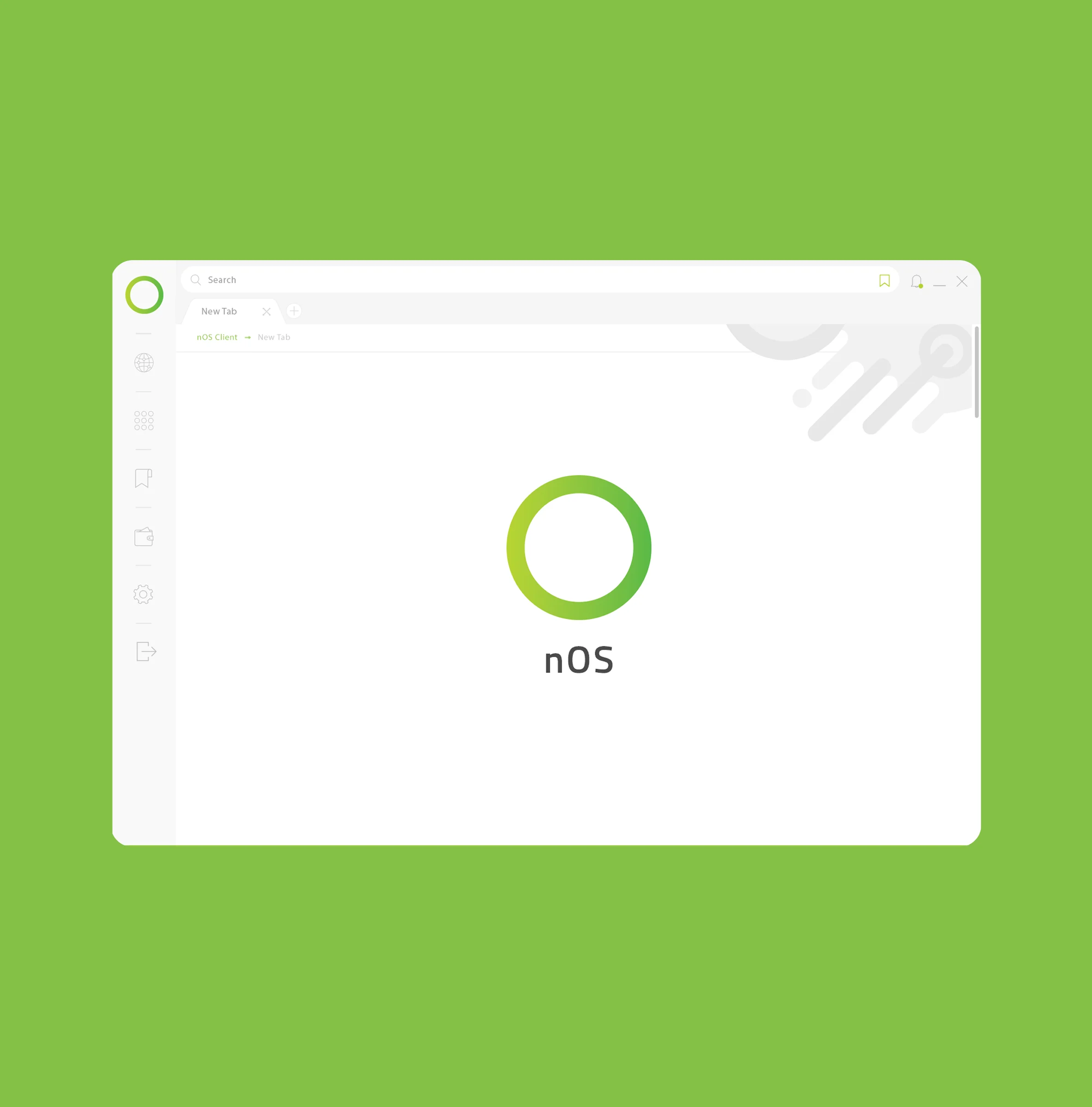
nOS logo is a circle, so we employed the round shape all over the design of their software. We emphasized on the minimal design, light colors, roundy geometric elements. The result looks very lightweight, ultra-modern and classy.
The Product
To start the project, we created an existing informational architecture - it helped us determine all functionalities and improve navigation in the updated project. nOS aims to overhaul the app-, web-, and cryptocurrency experience for consumers and creators alike, by introducing new solutions for app and content development, monetization, discovery, and interaction.
.webp)
UX/UI Design
Let’s Work Together

.webp)
.webp)
.webp)
.webp)
.webp)


.webp)
.webp)
.webp)